Meserve
10/30/2014 02:49:31 pm
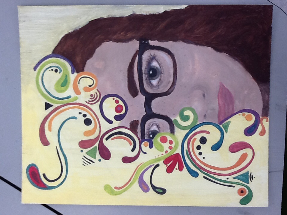
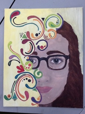
The portrait is strong. I like the overlaying of the design elements over the portrait. I don't like how the background shifts though. It makes it look too empty behind the abstract design. You lose all sense of depth in the work. Leave a Reply. | ArchivesJanuary 2015 AuthorWrite something about yourself. No need to be fancy, just an overview. |
 RSS Feed