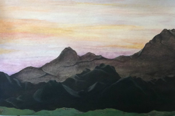
In this project we focused on aerial perspective. The darker the image/object is, the closer it is. A problem I ran into was that when I made things darker-to make it seem closer- they still seemed very distant and it was hard to try an fix that. I like the way the sky turned out. The colors are nice because they are complimentary yellows and purples. I think it turned out good, but I could have done better with making things seem closer.
