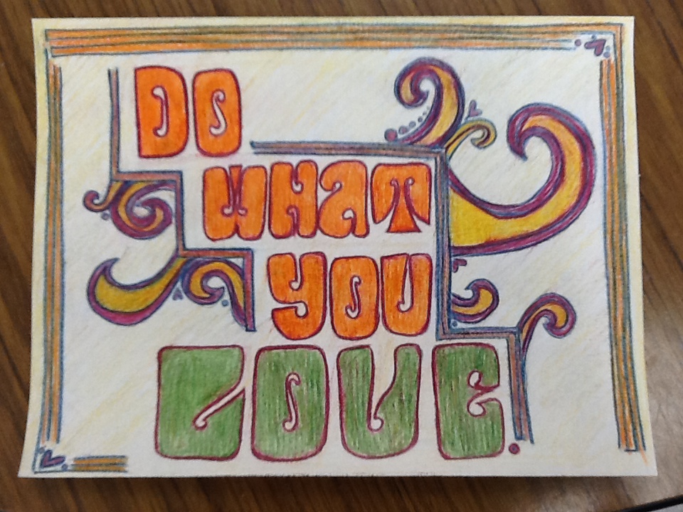
In this project I used lines to create movement and balance the negative space. I used a font type I found interesting to look at and makes you look a little closer. I used complementary colors to contrast and make certain parts of the piece pop. The picture doesn't do the color decency, in my opinion, but I think it looks pretty rad overall.
